Showing posts with label visual literacy. Show all posts

Monday, April 10, 2017

Perfectly illustrated information


Animals by the Numbers: a book of animal infographics by Steve Jenkins is well worth picking up for teaching both science and math for grades 2-7.

As is Steve Jenkins’ typical MO (and stated in the title) this book is all about the animal world that he finds fascinating, giving us tons of statistical information as infographics. I keep waiting to have that ‘been there, done that’ feeling when Jenkins comes out with a new book but it's yet to come. He continues to find fresh ways to introduce us to the endlessly fascinating natural world.

And what’s not to be enthralled by?

Whether he’s looking at the big picture (invertebrates vs vertebrates or the number of species such as 5,500 mammals vs 1 million species of insects) or the finer details (size, speed, life spans, heartbeats, tongue size, amount of sleep) he presents the numbers in captivating graphs and charts.  And when you’re a math-a-phob like me, that says a lot.

Steve Jenkins has an amazing ability to capture and hold the interest of his readers by looking at ranges of animals, comparing and contrasting characteristics and behaviours that illustrate just how nuanced, varied and adaptive the animal kingdom is. Comparing humans in some cases certainly may put us in our place. Compare the biomass of all the humans in the world, 350 million tons to that of all insects, 100 billion tons and you can see what I mean.

The illustrations are composed of paper cut outs and paired with various types of pie, flow and bar charts, histograms, pictograms and graphs. These representations are clear and easy to understand.  He finds ways to make each topic relatable to basic knowledge levels. For instance when comparing the loudness level between species he includes noises produced by humans too such as those from lawn mowers, chainsaws, firetrucks or jet planes. Did you know that a cicada  produces the same level as noise as a firetruck? Or, that a bulldog bat makes a sound that falls in the same range as a jet plane?

I highly recommend this addition to Steve Jenkins' body of work for any classroom.  Those interested in animals and nature will be captivated

Monday, October 31, 2016

Zero Shades of Grey


The recent arrival of Black Cat, White Cat by Silvia Borando got me thinking about other picture books that have a black and white theme and how most of them can be tied into the bigger concept of perspective.

Take Black Cat, White Cat. Black cat only goes out during the day and wonders what he’s missing at night. White cat (as you might expect) only goes out at night and also wonders what might be going on during the day. The two meet and show the other the best part of their own awake-time. The two become close companions.  Very close companions. Any guesses as to the colour of their kittens?

This one speaks very nicely to the concept of perspective – seeing how the other half lives, that’s perfect for primary grades.

What Color is Caesar? by Maxine Kumin is a romp as a dog tries to figure out whether he’s a black dog with white spots or a white dog with black spots. Asking other various black and white creatures their opinions isn’t all that helpful. Regardless of the fact that they, too, are black and white, they seem to perceive themselves as a different colour altogether. The black and white woodpecker sees himself as mostly red because he has a brilliant red crest. The black and white pony sees herself as green based on the important things in her life such as grass and trees.  And so on. It’s not until a make-believe circus guru helps Caesar find his own true colours that he finds some understanding about who he is.

Though the story addresses the idea of identity, it also presents perspective in an interesting way; Caesar seeks to understand himself better by asking others about their perceptions of themselves and of him. This one is good for grades 1-4.

Then there’s the classic, Black and White by David Macaulay. This one is a terrific picture book for older readers (middle school) as four seemingly separate stories unfold at the same time. Each double page spread presents a single frame of each of the four stories: a boy traveling on a train, two children wondering why their parents are acting so oddly, commuters delayed in getting home, and finally a masked robber caught up in a herd of black and white cows as they escape their paddock. Working through the storylines, the reader can take up the different perspectives offered and create their own narrative. Eventually, certain elements begin to overlap between the frames and thus, the stories. What the reader comes to learn is that this is a single story but told from different perspectives. Each storyline has been illustrated in a distinctive style and colour palette that helps the reader distinguish each story.


The last one in my retrospective in also titled Black and White written by Dahlov Ipcar. Originally published in 1963 this was reproduced in 2015 with the illustrations restored and remastered to the quality of the original work.  In this book, a black dog and a white dog are the best of friends, irrespective of their differences. (Think 1963 and civil rights.) The little black dog lives in a black house and dreams in black of dark jungles whereas the little white dog lives in a white house and dreams in white of starkly coloured Arctic landscapes. They share their dreams as best buddies do and get ready to frolic their way through the day, yet again. This one also would work well with the early grades.

So, it's just a matter of perspective whether you see the world in black and white or more like me, in a multitude of grey's. But it's something to talk about and kids, no doubt, will have one they may want to share.

Monday, May 9, 2016

Copyright 2015 -Really!

I really, really wanted to give Timeline: a visual history of our world by Peter Goes a rave review.

It was going to include: “fantastic graphics”, “wonderful design”, “beautifully produced” and “interesting if random selection of facts”.  I particularly liked the black band that runs across the middle of every page where all the events take place. It conveys the fluidity of time and how time periods merge and evolve.  It starts with the big bang, covering the beginning of life on earth, the age of dinosaurs, early hominids, early civilizations mostly in Europe and central Asia moving through the centuries up until the 2010s. (Whew! It’s quite a ride.)

And all of these observations are still valid.

It is an oversized, beautifully produced and designed book. I love the illustrations.  This is a great book for browsing. There’s lots to look at and minimal text.  It is fun to find small comical drawings (look for Big Foot in northern Canada), but --

But…

I was kind of willing to overlook how the perspective was predominantly Euro-centric  until I noticed a couple of graphics portraying the aboriginal peoples in North America.

Sigh.

I’m having a problem with the images selected for the pages Explorers from All Periods and North America in the 18th Century. The images in the Explorers panel places a tepee, a seated Native with a feathered headdress, smoking a pipe, a woman with a baby strapped to her back and a totem pole all placed smack dab in the middle of the United States. The images in the 18th Century panels show several tepees and almost every single Native sports a feather in their hair. And again a totem pole is placed next to the teepees and herd of buffalo. Problematic, anyone?

I realize that any timeline that undertakes representing the history of the world in 73 pages is huge. This means that not all significant events will make the cut. It also means the illustrator will want high recognition factor from the images so that text is minimal and space is maximized. I would agree that these images are very recognizable but totem poles were not part of the indigenous cultures located on the plains of America. There were carved by the peoples living along the northwest coast of North America. The feathered-headdress, peace-pipe smoking Indian is such an overused stereotype and cannot represent the all North American indigenous peoples.  In a word, inappropriate.

This is my main beef with this book.  I know my perspective is based on becoming very aware of how indigenous peoples have been, and sometimes, still are depicted in children’s literature.

I’m not recommending this book outright but I’m not condemning it totally either.  I do think it could be useful in classrooms with careful teaching. Discussing what these images represent, how they are misleading and why other choices would have been better, becomes an opportunity to talk about stereotypes.

I think the best way this book can be used in a classroom is by looking at what constitutes a timeline, the significant events that were selected for their defined time periods, what they included (the first James Bond movie) and excluded (Arab Spring) and have students research their importance or perhaps figure out what events they would include, as well.  I think grades 6 and up may find this book useful.


Monday, September 14, 2015

About Time


There’s some comfort in knowing that favorite things can have long lineages.  Whether we’re talking about family traditions, favorite objects such as toys (Much Loved) or books (Alice in Wonderland turns 150 years old this November) there’s security to be had in familiar things passed down.

Food falls into a category by itself in my opinion.  Besides being a necessity of life, we’ve imbued particular dishes with cultural significances or familial prominence that become part of people’s identities.  Think barbecue, pasta or tea and the southern United States, Italy or England (or China) come readily to my mind.


A Fine Dessert: four centuries, four families and one delicioustreat by Emily Jenkins and Sophie Blackall tie all of this together in a sort-of narrative timeline.
The dessert, blackberry fool, remains the same, made from the same ingredients, for over 400 years.

But so much else can and does change, too.

Four families, spaced 100 years apart from 1710 to 2010, show the reader lots of changes over that time, not just in terms of technology, but also who does household chores. The 1810 family includes female slaves who make and serve the dish, whereas in 2010, a boy and his father make this dessert for a gathering of very diverse people. However, the technological changes are interesting too, moving from twig whisks to electric mixers and outdoor ice houses to modern day refrigerators.

Getting the ingredients from picking your own berries and milking your own cow in 1710 to going to a grocery store in 2010, shows how we’ve been removed from the direct procurement of food.

The illustrations are terrific with historically accurate details included for each setting.  I enjoyed reading the author’s and illustrator’s notes about how they decided on which settings, families and details to include. They also include a recipe for you to try, too.


Elementary teachers would find this book useful for teaching concepts about the big concept of time and the nature of change within social contexts.


Monday, November 24, 2014

Visual literacy: Power of a photo


Right off the bat, I have to fess up to loving the series Captured History and Captured World History.

I've blogged about one of the books, Migrant Mother by Don Nardo a while back, in fact.
And I'm immensely grateful that the publisher (Compass Point Books) has branched out into world history with their latest offerings.

These books focus on iconic photographs that have had an impact on the viewing public, changing and forming public opinion about social issues such as migrant workers during the American Depression era, about child workers in the early 1900s,  the cost of war, specifically the American civil war, the environment, and international politics to name but a few.

They are organized following  a basic format:  rudimentary background about the ‘moment’ to set up the image,  in-depth historical information about  the period, information about the photographer, his/her work and what was happening when he/she took the photograph and then, what lasting impact the image has had. Also included are timelines, glossary, reading lists, internet resources, bibliography, index, and a few critical thinking questions.

These real-life stories really get you into the picture you’re looking at, establishing context so that we can understand why the photo was and often still is important and what were the implications for social change.

So, have I convinced you that these series are worth checking out?


Another recent arrival in the Doucette Library is PhotosFramed: a fresh look at the world’s most memorable photographs by Ruth Thomson.

It does a similar job focusing on notable images (27 of them to be precise).  These are organized into groupings according to the intent of the photo.  Categorized as portraits, nature, art, and documentary,   each section displays several photographs that range over time.  For example, Portraiture includes an 1844 image of Louis Daguerre who produced the first permanent photograph, a 1949 of Pablo Picasso, Che Guevara in 1960, Afghan girl in 1985, and the Royal Wedding of Prince William and Kate Middleton in 2011.

Each photo is accompanied by a preceding page that contains information about the photograph, the photographer, two boxed commentaries that zoom in on very specific aspects of the image, and three questions to make the viewer think a little more deeply about this image.

For example, when viewing the famous National Geographic 1985 photo of a refugee Afghan girl we are asked to think about:
*How does the girl’s direct stare make you feel?*How might the effect of this photograph have differed if the photographer had taken a wider shot?*If you had to put this photograph into a category, with would you choose: portrait or documentary or both? Why?

I found this book fascinating because it did include so many images, many that I was unfamiliar with, so I could browse.  The point of memorable images is that they draw you in, make you wonder what the story is, and then revisits you time and again.


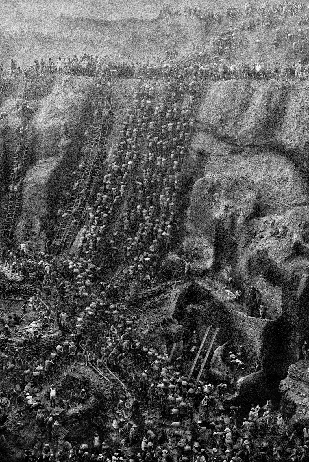
Take the 1986 photograph of the Serra Pelada gold mine taken by Sebastiao Salgado (pp.52&53) that document
 the enormity of the man-made mine, with carved-out hollows and terraces and long, rickety ladders leaning against its steep sides.  The packed crowd of miners, shifting their loads of earth, appears to move as one, in a continuous flow, like ants.It is an evocative image.

There is some overlap between the Capturing History series and Photos Framed which I found interesting and great for comparing the two.

Check out Tank Man: how a photograph defined China’s protest movement by Michael Burgan and p. 54 and 55 in Photos Framed.  Tank Man  (the book) is full on – everything you need to know.  Photos Framed is much more cursory with just the basics for context.   The questions posed by each are interesting and, I think, complementary.  Photos Framed gives us three questions that make us analyze and deconstruct this specific image whereas Tank Man provides questions that take us beyond the image having us think about the implications, like the attitude of the protesters, understanding aspects of democracy, and the power of such an image.

I’m recommending both books for the middle grades (grades 5-9’ish) but I think students in high school would find these fascinating and very approachable.  Students working below reading level might feel less daunted but still come away with an increased understanding about significant moments in history and today’s world.


Monday, January 13, 2014

Infographics - part 2

Prior to the holiday break I looked at a couple of books from a series that used infographics to convey information about specific topics.  That series was The World in Infographics.

In this post I'm looking at another series, SuperScience Infographics published by Lerner Publications Company.


I looked at three titles:
Life science through infographics by Nadia Higgins
 Weather and climate through infographics by Rebecca Rowell and
Forces and motion through infographics by Rebecca Rowell.


These are more specific in their scope than The World in Infographics.  With that in mind, each set of double pages focuses on a single aspect of a topic. For example in the book about weather and climate, there are pages that focus on the sun, the seasons, temperature, atmosphere, precipitation, wind, ocean currents and more.  Forces and motion covers topics such as speed, different types of forces, motion (of course), gravity, simple machines and buoyancy.  Life science includes evolution and fossil evidence, habitats, DNA, cells, life cycles, and extinction.


All the books provide interesting information.  The graphics are clear and well done, but on occasion, I thought that some of these seemed to be more like illustrations than an infographic representation.  SuperScience Infographics also includes a glossary, an index and a list of resources (both online and print) for further reading.


Both series are like factoid books in the end, due to the vastness of the topics that they cover.  They make good introductory resources for their intended audiences (grades 4-7 and striving readers).  Overall, I like the first series The World in Infographics more, but I would use and will recommend both series. 

Monday, December 2, 2013

A picture is worth…

Infographic:
Information graphics or infographics are graphic visual representations of information, data or knowledgeintended to present complex information quickly and clearly. They can improve cognition by utilizing graphics to enhance the human visual system’s ability to see patterns and trends.  – from Wikipedia 

 Have you ever noticed that once something catches your attention you begin to see it everywhere?  And then you start thinking, how long has this really been around and why didn’t I notice it sooner?

Infographics have been like that for me.

It started with How to Land a Jumbo Jet: a visual exploration oftravel facts, figures and ephemera edited by Nigel Holmes.  I blogged  about it in June, I liked it so much.

Then later in the summer I latched onto these new-fangled looking posters from Pop Chart Lab.  They seemed pretty cool, about some interesting or unusual topics or depicted information in a new way.  I ended up buying some of these posters for the Doucette Library’s collection.  I love the one that shows the ingredients of pies displayed as pie-charts.  I can’t say, however, that I’m really all that fascinated in analyzing the names of rappers but the fact that there is a poster that does just that really excites me.  I know there are people (aka students) out there who will love it.

And so it goes.  Here and there, ‘infographics’ keep popping up in all sorts of places.

Most recently, I’ve brought in a few books from a couple of series where the whole book is done as an infographic about specific topics.  Here are the first two:

The Human World: the world in infographics  and Planet Earth: the world in infographics both written by Jon Richards and Ed Simkins are like other information books that present a lot of interesting facts about people and how we live and the Earth and its natural phenomena

The Human World covers everything from the number of people on the planet, where we live, the haves and have-nots, resource usage including water, creation of waste, communication, travel and transportation. The data is presented in a way that allows us to see a visual representation that allows easier comprehension of bigger ideas by comparing and showing relative size of differences.  For example, in the “Dwindling Resources” section 6 barrels of oil that represent 6 countries and how much oil they use.  No surprise, the US consumes the most oil on a daily basis (19,150,000 barrels per day) and gets the biggest picture of an oil barrel.  Next comes, China (9,189,000 bpd), Japan (4,452,000 bpd), India (3,182,000 bdp), Russia (2,937,000 bpd) and last, Island of Niue (40 – yes, forty!, bpd).  This last one, the barrel is so tiny I didn’t even see it the first time I read it.

In Planet Earth we see how the earth is composed of layers of varying depths and temperatures, moving tectonic plates, earthquakes, mountains, volcanoes, oceans and rivers, the rock cycle, the water cycle, which all create and sustain the environment that exists on earth.  Again, lots of numbers are used to help us understand the relative size and differences. Let’s say land versus water.  71% of the earth is water. 29% is land.  Of that 29% land mass, 31% is desert, 33% is grassland and 36% is forest. A pyramid shows how wet or dry and cold or hot each habitat is in relation to each other.  Deserts are hot and dry whereas tropical forests are hot and wet.  Higher up the pyramid, a coniferous forest (subarctic) will be much cooler and neither overly wet or dry.  (The picture works way better with way fewer words.)

These books include glossaries, indexes and web resources to follow up both the statistics about these subjects as well as the infographics.

Overall, I liked both of these books.  They are factoid books at heart but allow us to develop a deeper understanding through the graphics showing comparisons and relations between similar elements.  Bringing these into the classroom allows for cross-disciplinary potential.  Use for math and science or math and social studies with some graphic art thrown in for good measure. Striving readers who struggles with dense text will find these less daunting to read.


I would recommend these for grades 4 to 7.

Monday, August 27, 2012

Word Play 2

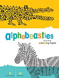
Last Monday I posted a recommendation for Word Images by Ji Lee.  This week I’m sticking with the whole playing with words and letters theme with Alphabeasties and Other Amazing Types by Sharon Werner and Sarah Forss.


This is not your average alphabet book. Besides each letter being represented in animal-form, constructed from the first letter of its name the reader is treated to an exploration of font, as well.

For example, ‘A’ is for alligator.  The alligator is made up of many letter ‘A’s, both in upper and lower case.  Now think about alligators for a moment.  What are some of its characteristics? The font chosen is Volta EF.  The ‘A’, especially the capital ‘A’ when used to outline the alligator shape is rather spiky or bumpy sort of like its skin.  The peak of the ‘A’ is also reminiscent of the snapping jaws of the alligator.  We can get a very good sense about the nature of this animal from the type of font selected and how it is arranged.

Along the bottom of each page is a bit of further exploration of the letter ‘A’ in different typefaces.  Instead of a pointy peak, the top might be rounded bringing to mind an arch or an alien.

‘E’ is for elephant and as rendered in Cooper Black font, we get the sense that there is a certain blobby roundness to this elephant.  But sharpen up some of those corners and tilt it to the right and maybe your ‘e’s are looking to escape.

A few of the pages have extra bits that fold out adding to the whole artistic feel of the book.  The octopus has a couple of wavy tentacles that must be accommodated and the unicorn definitely needs extra space as it rears up to shake out its very sumptuous mane.  Whoa, Baby!

Some of the fonts are pretty typical and can be found on most word processing packages such as Helvetica Rounded, Goudy Italic, and Bodoni Poster.  Some I’m unfamiliar with like Wave Weekend, Giddyup or Filosofia.  They’re all fantastic.

There are lots of playful bits to this book that really bring home the fanciful nature of word play and design.  The authors encourage kids to think up some of their own fonts to convey or enhance their writing. Like Word Images, it encourages us to think a little more about the attributes of a word and display it in a very creative way.

I would recommend Alphabeasties for students Kindergarten to grade 9. Upper grades will get more out of this for book design elements and ideas for using fonts.


Today's Nonfiction Monday event is being held at Simply Science.  Check out other blogs to learn about additional nonfiction children's literature.

Monday, August 20, 2012

Word play


I can’t say enough good things about Word as Image by Ji Lee (793.734 LeW 2011) – but I’ll try.

It’s wonderfully creative, brilliantly playful, and just out-and-out unique.

The book is a compilation of words that somehow incorporate an attribute of that word just using the letters it’s made  from.

Let me give you a few examples:

Elevator:  the letter ‘V’ becomes a down button, the letter A without the crossbar become the up button. (See the image on the above book cover.)

Rabbit: The capital letter ‘R’ is turned upside down so that we see the rabbit ears sticking up.

Parallel: all the ‘l’s’ are made to run the whole length of the page running parallel with each other. The remaining letters are just normal.

These are all fairly straight forward examples that show the playful side of these constructions.  There are some word-images that are really, really clever but are a little more difficult to describe so that you’ll ‘see’ their impact.

Pollution: The word is located on the bottom edge of the page.  The two ‘l’s represent smokestacks  spewing out black smoke that colours in the top of the page.  The page is most black with graduations of grey.

New Orleans:  only the top half of these words appears on a write background and the missing bottom half are submerged.

China/Tibet:  Against a red background the huge, yellow, capitalized letters of China dominate the page. The word Tibet, in small white letters is engulfed in the ‘C’ in China.

My favourite is Israel/Palestine which you will just have to see for yourself.  Too much would be lost in trying to describe it.

I hope I’ve given enough description that you can get a sense of what some of the constructions entail both visually and metaphorically. Check out the author's website for more examples.

The author includes the ‘rules’ for constructing the word images which are basically to use only the shapes of the letters without adding extra parts.

What great potential for a classroom activity to demonstrate understanding for a topic.  Language arts, social studies and art could all be connected with this little book and the extension it provides.  The book is entertaining for many age levels but you should note that a couple of word-images, with more adult connotations, might make some people uncomfortable. 

Makes you want to start making your own word-images, doesn't it?
Today is Nonfiction Monday at the Jean Little Library.
Check out this round up of children's literature focused on nonfiction.

Monday, June 25, 2012

The Power of Pictures


A couple of weeks ago I listed a few professional teaching resources about visual literacy, highlighting the connections between the content areas. Understanding what goes into making a great or powerful image is important to visual literacy, both in creating our own pictures and deconstructing the work of others.
Today’s book, Migrant Mother: how a photograph defined the Great Depression by Don Nardo (973.917 NaM 2011) is a great example of deconstructing what turns a picture, in this case a photograph, into a strong visual statement about something else. 

The picture on the book’s cover is one most of us have seen: Dorothea Lange’s iconic black and white photo of a pensive mother, looking off to one side, away from the camera and three of her children, unkempt and wearing tattered clothes.

It’s easy to see why this is often shown in conjunction with the American 1930s era of economic downturn -- desperate farmers driven from drought stricken farms, smothering dust storms, indigent migrant workers, long bread lines and many, many photos of people looking wrung-out or exhausted, often with little resiliency left –  all of these can be alluded to in this photo.

The book sets it up beautifully. It starts with Dorothea Lange’s motivation for taking on the cause of poor, displaced migrant workers. As a successful studio photographer, she had no need to take on the job other than a desire to make a difference in the lives of these desperate people.  By publicizing their plight, the causes, and the lack of social welfare, Dorothea Lange saw a way to raise awareness across the country and mobilize the government into providing assistance.

The book provides enough information about the Great Depression without too much detail. As expected, more emphasis is on how Dorothea Lange met this woman and the series of photos (a total of six, which surprised me) she arranged to get us to enter into this world of deprivation.  Who the woman is, what her life was like before and after the photograph was taken, her family and her thoughts about the photo are fascinating to read about, too. 

 For such a short book, there is a lot here to show us the significance of this photo and how such a photo became an icon for its time.  I’m looking forward to seeing more from this series.

Check out today's round up of recommended nonfiction children's literature at Capstone Connect.

Thursday, June 7, 2012

Professional resources – visual literacy.


In Monday’s post I wrote about infographics as illustrated in How to Land a Jumbo Jet. However entertaining or inspirational this book is, understanding and creating graphics falls within the broader concept of visual literacy.  Many of the ‘skills’ needed to analyze, interpret and create pictorial representations of information are embedded within the curriculum.  Critical thinking, classification, sequencing, deductive and inductive reasoning, hypothesizing and critiquing are skills found in the all the content areas.

Following are a few recommendations for books that will help you develop your understanding of visual literacy and the potential that it has in the classroom to engage students.

Teaching Visual Literacy: using comic books, graphic novels, anime, cartoons, and more to develop comprehension and thinking skills edited by Nancy Frey and Douglas Fisher (372.6 FrT 2008).
            Well, the subtitle pretty well covers it.  This book is a collection of essays that will give some basic background information, with chapters focussed on specific aspects of visual literacy.  Besides the formats listed in the subtitle. there are chapters about using picture books, films, and political cartoons and about how students with disabilities can be supported in their learning through visual literacy.

Visual Impact, Visual Teaching: using images to strengthen learning by Timothy Gangwer (2nd ed.) (371.3028 GaV 2009).
            This one provides a solid overview of the different types of learning and how visual learning fits into almost any teaching environment.  Gangwer is very big on using photos and having kids do the picture taking. He provides many examples of classroom situations to illustrate his points. Half the book is activities that will engage students in different ways.in all content areas (language arts, math, science and social studies) and also in arts and humanities, environmental education, life skills, enhancing self-esteem and global holidays.

Visual Tools for Transforming Information into Knowledge by David Hyerle (2nd ed.) (371.3028 HyV 2009)
            This one gets a lot more specific, focussing on specific tools. As listed in the book, these include: brainstorming webs for fostering creativity and open mindness; graphic organizers for fostering analytical content and process specific learning; conceptual mapping for fostering cognitive development and critical thinking; and Thinking Maps, a unique synthesis language of visual tools.

Developing Visual Literacy in Science K-8 by Jo Anne Vasquez et al. (507.1 VaD 2010).
            Though this one does focus on science it also provides an overview or ‘primer’ about visual literacy. The authors touch on the best known tools such as graphic organizers, conceptual maps and brainstorm webs but also delve into ‘3-D graphic organizers (foldables).

However deserving teachers are of their summer breaks, many also will get caught up on professional reading.  It may be that one of these titles will help you further your understanding and add to your instructional practices for visual literacy.

Monday, June 4, 2012

Infographic-ophile – that’s me.


I’m a very visual kind of learner and this translates into using lots of visual aids (posters, maps, diagrams, books, kits, etc.) when I’m presenting a classroom workshop. When I’m thinking through an idea, I’ll usually start with a mind map of some sort. For instance, when I was developing ‘bibliographies’ for curriculum topics like geographical thinking, I knew I didn’t want to only make a list on piece of paper, which was going to be stuffed into a binder and forgotten. I wanted something that would offer content or ideas connected to the books.  I came up with mind maps that explored ideas and questions related to the Alberta curriculum and linked to a website with the recommended books. If you’re interested in what these look like, click on Books for Big Ideas.  My whole point being that combining facts with graphics can be an interesting and useful way to explore ideas.


How to Land a Jumbo Jet: a visual exploration of travel facts, figures and ephemera edited by Nigel Holmes (910.202 Ho 2011) is my kind of book.

So, what do learn about the world from this book?  Places to go nude, countries with the most airports, active volcanoes in the Ring of Fire, recommended vaccinations for different regions of the world, who is proud of their nationality and by how much, which country consumes the most coffee per capita, world’s most visited destination, what to take when backpacking, wettest and driest places on earth, which cities are recommended for the food, etc., etc., etc. – it’s all here. Lots of information, from the obscure to the arcane to the obvious.

But they are far from being dry, boring, clinical.  Each topic is displayed using some form of illustration with colour, pictorial elements, and varying fonts. Some are brilliant yet simple such as Fast Food, Fast Facts (shown here) or Top Trails , giving you easy to follow, interesting, pertinent and comparable facts.  Top Trails looks at five of the world’s most popular hiking trails (Colorado, Kungsleden, Haute Route, Mount Kilimanjaro and the Inca Trail) and compares the distance, maximum altitude and starting altitude for each.  The graphic used for comparing the distances also conveys how much walking up and down a hiker would do, as well as the steepness.  Comparing the altitude for each of the hikes is very easy to understand as they are all plotted on the same mountain with Mount Kilimanjaro at the very top(19,336ft.) and Sweden’s Kungsleden hike at the bottom, a mere 3,773 feet.  Look how many words it took me to explain just these two components of this infographic.

Some of the charts are not very readable or appear too cluttered, which turns me off.  This won’t be the case for everyone. A colleague pointed out that if the book had been printed in a larger format, these illustrations may have been much more legible.

What I’m taking away from this book is the method of displaying information in a pictorial way with lots of zing for interest’s sake. If you’re into travel – great – you’re going to enjoy perusing the information contained within each graphic.  If you’re not, that’s ok, too.  This book can be source of inspiration for you and students when coming up with new ways of presenting information.  Some of these infographics are pretty sophisticated but with so many graphic organizer packages available (commercial and free) students may surprise you with how far they can go.  The possibilities are endless, as How to Land a Jumbo Jet demonstrates.


Today is Nonfiction Monday.  Hop on over to True Tales & a Cherry on Top to see a roundup of reviews of nonficiton children's literature.

Template Design | Elque 2007